I have a full bottle of this ink now! The 30ml J. Herbin bottles are flat, square-shaped glass bottles with a paper label on the front. I like the labels because they show you what the color is like, and they also have a cute drawing on the front. Ambre de Birmanie translates to Burma amber, so there's a drawing of a chunk of amber on the front.
Ambre de Birmanie is an ink that has a real similarity to honey. I don't think it's quite like an amber—when I think of amber, I think of a slightly deeper, more orange color. But it is fairly close to what I think amber would look like.
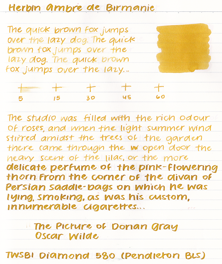
You can probably tell that the writing sample here is quite a bit lighter than the image that starts off this review. Ambre de Birmanie has an interesting quality: the more ink you put down on the page, the darker the ink appears. It's really quite lovely.
This ink is quite light, but it still has a surprising amount of water resistance. It really clings onto the page.
This ink takes a little more than 15 seconds to dry.
There isn't a lot of shading in the fine nib—really, I would say that there isn't any at all. Even in the broad nib it's quite a flat shade, though it does have a nice "ring" around letters.
I compare this ink to other ones that I have. Colorverse Golden Leaves is more orange. 3 Oysters Mustard is a little more brown. Diamine Citrus Ice is very clearly an orange and it has silver shimmer in it.
I have this ink in my TWSBI Diamond 580 with a Pendleton Butter Line Stub + Flex. It's a finicky nib but when it works it's really worth it. Ambre de Birmanie really shines in this nib size: at times it's lightly golden, and other times it's a rich deep shade.
Where to buy
I purchased this ink with my own funds.This post was updated on 12/15/19 to match my current review methodology.


No comments:
Post a Comment