
Faber-Castell is a German art supplies company. Graf von Faber-Castell is their luxury brand that focuses mostly on fine writing instruments. I suppose then that these inks would be considered luxurious. They certainly feel that way! They're packaged quite nicely in a box that includes a small pamphlet with depictions of all of the inks in the lineup. I'm not sure how accurate the little pictures are, but it's a nice inclusion.
The bottle is quite heavy and made of glass. The cap has a metallic coating and the Faber-Castell coat of arms on the top. The name of the ink is written on the front, which is quite helpful.
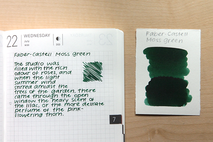
Graf von Faber-Castell Moss Green is a darker green.

For information on how I do my reviews, please visit my policy page.
It has a decent amount of water resistance. Quite a bit of the ink will lift and puddle, but most of your writing will stay behind.
On Kokuyo MIO paper, it took quite a bit to dry: over 30 seconds. Most of the inks I test on this paper dry within 20-25 seconds.
The color stays largely consistent in both fine and broad nibs. It's a bit lighter in fine nibs, but not by much.

On Tomoe River Paper, I thought there might be a little bit of red sheen. It's not super visible though.
 I compare it here to a couple of different colors. Colorverse Schrodinger is fairly close, though it's not quite as cool. Colorverse Interstellar Space is quite a bit less saturated.
I had this ink in my Pelikan M205 with a broad nib. This pen is quite wet and Moss Green worked well in it. I didn't have any issues with flow, and I ended up using up Moss Green pretty quickly.
Where to buy
I received a sample of this ink for free as an employee of JetPens.- JetPens: bottle
Green is the most challenging ink color for me. I had high hopes for this one (as Robert Oster Moss) and indeed I do like the color, I just don't like it coming out of a pen!
ReplyDeleteI found this one way too saturated for my more "muted" palette, and assumed all GvonFC inks would be similar, but have subsequently been rather impressed by their Olive (a nice discreet grey green), Burned Orange and Hazelnut. I do like that cartridges provide an affordable method of sampling.
. . . . and I do like those "bouncy" nibs on their pens!