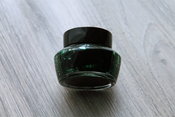
Weirdly enough, I've found Jentle inks to be rather... bubbly? I usually shake my bottles before I fill them to make sure that pigments or dyes don't settle, and every time I've opened a bottle of Jentle ink I come face to face with these massive bubbles. Furthermore, these Jentle inks are sticky (this isn't the right word at all). The little... foam? paper? insert on the inside of the cap tends to attach to the bottle opening. If ink gets stuck on the rim, little flakes of dried ink can fall off when you open the bottle.
Edited to add, but I completely forgot to add that Sailor Jentle inks have a smell. I don't quite know how to describe it. It's slightly sweet? It's not an unpleasant smell to me, and it's not strong unless you stick your nose in the bottle or something, but it's definitely there.
I find opening these bottles very satisfying, because for some reason they have the same "tug" as when you open, say, a new jar of jam. A little pop, I suppose I should say. Is this just me? I certainly don't have an explanation for it. Anyway...
These couple of things aside, lets move straight on to the actual ink. Tokiwa-matsu is, at its core, a dark forest green. The name translates to "evergreen pine," and that's for sure a nice fit for this color.
For information on how I do my reviews, please visit my policy page.
It's a touch deeper in reality than in this scan, but it's pretty close. This is a difficult ink to capture.
There's almost no water resistance here. A little bit of it will cling to the page, but you'll lose most of your writing.
Tokiwa-matsu doesn't take too long to dry, with it dry to the touch by the 30 second mark.
Since it's a rather dark ink, you'll find shading to reveal itself in broader applications. The shading is quite interesting: it goes from a medium forest green to something like a brown-green. And further, this ink changes as it dries down, from that medium forest green to the color you see in these scans.
On Tomoe River paper, you can see the sheen and shading come to life.
I compare it to some other greens I won. Nagasawa Kobe Sorakuen Tea Green is a little bit close, but it's a bit more vibrant. Diamine Safari is a khaki green. Pelikan Edelstein Olivine and Colorverse Interstellar Space are both grayer greens.
I had this ink in my Lamy 2000 oblique broad. What a gusher of a pen—it really does show off the shading and sheen of this ink. No issues at all here.
I'm not sure if I would purchase this ink again, despite its attractive color and healthy amount of sheen. I think this is much more a problem of me having way too much ink to consider re-purchasing rather than me disliking the ink. In 300 years, when I finally whittle down my ink collection, I'm sure Tokiwa-matsu will join me again.
Where to buy
- JetPens: bottle
- Wonder Pens: bottle + sample
This post was updated on 6/30/19 to match my current review methodology.


No comments:
Post a Comment